ShopDreamUp AI ArtDreamUp
Deviation Actions


Suggested Deviants


Suggested Collections


You Might Like…


Featured in Groups


Description
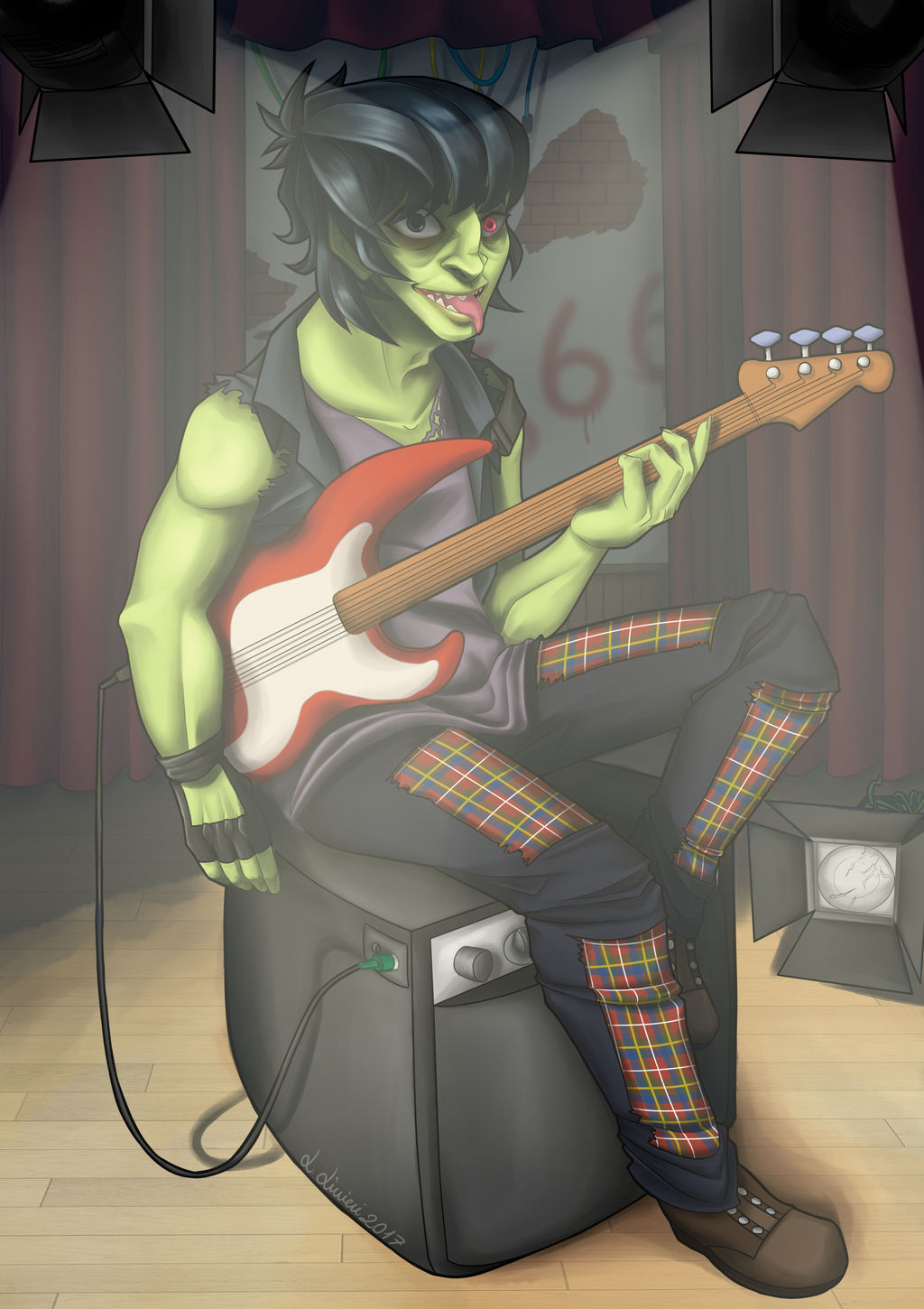
I'm finally uploading this!
I'm not sure you knew, but a while ago I took part in a no-profit tribute artbook for the Gorillaz, in order to celebrate the new album. The artbook got printed and sent, so I decieded to uploade my illustration here, so that you can see it!
Of course I was going to draw our favourite Pickle man :'D
Sweat Collection - A Gorillaz Tribute Artbook
fav.me/db6a77c
 hoshinodestinyart.tumblr.com/p…
I'm not sure you knew, but a while ago I took part in a no-profit tribute artbook for the Gorillaz, in order to celebrate the new album. The artbook got printed and sent, so I decieded to uploade my illustration here, so that you can see it!
Of course I was going to draw our favourite Pickle man :'D
Sweat Collection - A Gorillaz Tribute Artbook
fav.me/db6a77c
hoshinodestinyart.tumblr.com/p…Image size
1751x2479px 2.94 MB
Comments24
Join the community to add your comment. Already a deviant? Log In
Hello! I am from  I am sorry that it took me this long to get to you. Please forgive me!
First things first... hey, a Gorillaz fan! I haven't heard from them in a long, long time. But they had some great music in the past. Did you say they are coming up with a new album? Cool! (Smile)") I think there's a lot of atmosphere with this picture. Murdoc here is seen in full light, and his got a great, relaxed body language with enough whimsical details to round out a great portrait. I also need to mention that most of the the lighting was done very, very nicely. The blurry, overlapping shadows that is the result from multiple spotlights really showed up nicely here. And all the details on his clothes! That must have taken a long, long time. And it's very nicely done, too.
I think there's a lot of atmosphere with this picture. Murdoc here is seen in full light, and his got a great, relaxed body language with enough whimsical details to round out a great portrait. I also need to mention that most of the the lighting was done very, very nicely. The blurry, overlapping shadows that is the result from multiple spotlights really showed up nicely here. And all the details on his clothes! That must have taken a long, long time. And it's very nicely done, too.
Now, how to make Murdoc even better?
The first thing that comes to mind is probably the anatomy. Murdoc is a bit of the long, lanky type (which is probably true of everybody in the band...) so this version of him is buff and muscular. But because he is so buff-looking, it's easy to lose track of the actual bodily proportions. His hands are comparatively too large in this case and his arm and forearm ended up looking short and stumpy in comparison. I also have the nagging feeling that his left arm is longer than his right. The way he's sitting also makes him look like he's got a bit of a gut. And that's just not Murdoc, you know?
There are a couple of other little details that can stand a bit of a revisit as well. The spotlight on the floor either have really badly broken flanges or it has the most solid shadows of everything around. And the same can be said about the shadow of the wire that goes from bass to amp. The shadow doesn't follow the trajectory of the wire itself! And finally, it looks like Murdoc has a fender bass in his hands (www.fmicassets.com/demandware/… ) But the curves on the body just doesn't look quite right. I highly recommend people to look up as many references as possible. They really, really help.
And finally, there is something else that you can consider experimenting with in the future. This picture is cropped really close. It's claustrophobically tight, really. The spotlights are right in Murdoc's face and the ceiling is really low. It's tough to hit the balance between "nice and cozy" and "up close and personal." In this case, I have a feeling you are teetering towards the "too close" side of things. There's really no right or wrong answer, but it's something to keep in mind and take some notice in the future.
Overall, I love how Murdoc looks here (and it's nice to know that there's new music from them!) I think you did a great job and these things that I have pointed out can be tweaked for the future. Good job!
I am sorry that it took me this long to get to you. Please forgive me!First things first... hey, a Gorillaz fan! I haven't heard from them in a long, long time. But they had some great music in the past. Did you say they are coming up with a new album? Cool!
Now, how to make Murdoc even better?
The first thing that comes to mind is probably the anatomy. Murdoc is a bit of the long, lanky type (which is probably true of everybody in the band...) so this version of him is buff and muscular. But because he is so buff-looking, it's easy to lose track of the actual bodily proportions. His hands are comparatively too large in this case and his arm and forearm ended up looking short and stumpy in comparison. I also have the nagging feeling that his left arm is longer than his right. The way he's sitting also makes him look like he's got a bit of a gut. And that's just not Murdoc, you know?
There are a couple of other little details that can stand a bit of a revisit as well. The spotlight on the floor either have really badly broken flanges or it has the most solid shadows of everything around. And the same can be said about the shadow of the wire that goes from bass to amp. The shadow doesn't follow the trajectory of the wire itself! And finally, it looks like Murdoc has a fender bass in his hands (www.fmicassets.com/demandware/… ) But the curves on the body just doesn't look quite right. I highly recommend people to look up as many references as possible. They really, really help.
And finally, there is something else that you can consider experimenting with in the future. This picture is cropped really close. It's claustrophobically tight, really. The spotlights are right in Murdoc's face and the ceiling is really low. It's tough to hit the balance between "nice and cozy" and "up close and personal." In this case, I have a feeling you are teetering towards the "too close" side of things. There's really no right or wrong answer, but it's something to keep in mind and take some notice in the future.
Overall, I love how Murdoc looks here (and it's nice to know that there's new music from them!) I think you did a great job and these things that I have pointed out can be tweaked for the future. Good job!