ShopDreamUp AI ArtDreamUp
Deviation Actions


Suggested Deviants


Suggested Collections


You Might Like…
![Laugh of My Life [COMMISSION]](https://images-wixmp-ed30a86b8c4ca887773594c2.wixmp.com/f/f8c6ff19-9111-49b6-b55c-5c0c36970f23/dbj2g7y-5ad85eab-599d-433d-afa3-1c4bdcbe25f4.png/v1/crop/w_184,h_184,x_0,y_5,scl_0.20444444444444/laugh_of_my_life__commission__by_smasherlovesevil_dbj2g7y-92s-2x.png?token=eyJ0eXAiOiJKV1QiLCJhbGciOiJIUzI1NiJ9.eyJzdWIiOiJ1cm46YXBwOjdlMGQxODg5ODIyNjQzNzNhNWYwZDQxNWVhMGQyNmUwIiwiaXNzIjoidXJuOmFwcDo3ZTBkMTg4OTgyMjY0MzczYTVmMGQ0MTVlYTBkMjZlMCIsIm9iaiI6W1t7ImhlaWdodCI6Ijw9MTAwMCIsInBhdGgiOiJcL2ZcL2Y4YzZmZjE5LTkxMTEtNDliNi1iNTVjLTVjMGMzNjk3MGYyM1wvZGJqMmc3eS01YWQ4NWVhYi01OTlkLTQzM2QtYWZhMy0xYzRiZGNiZTI1ZjQucG5nIiwid2lkdGgiOiI8PTkwMCJ9XV0sImF1ZCI6WyJ1cm46c2VydmljZTppbWFnZS5vcGVyYXRpb25zIl19.RFE40TymqT_OG_Eg_mHaDQBPHWz3MU5HyXlsQlBtxuU)
![Laugh of My Life [COMMISSION]](https://images-wixmp-ed30a86b8c4ca887773594c2.wixmp.com/f/f8c6ff19-9111-49b6-b55c-5c0c36970f23/dbj2g7y-5ad85eab-599d-433d-afa3-1c4bdcbe25f4.png/v1/crop/w_92,h_92,x_0,y_3,scl_0.10222222222222/laugh_of_my_life__commission__by_smasherlovesevil_dbj2g7y-92s.png?token=eyJ0eXAiOiJKV1QiLCJhbGciOiJIUzI1NiJ9.eyJzdWIiOiJ1cm46YXBwOjdlMGQxODg5ODIyNjQzNzNhNWYwZDQxNWVhMGQyNmUwIiwiaXNzIjoidXJuOmFwcDo3ZTBkMTg4OTgyMjY0MzczYTVmMGQ0MTVlYTBkMjZlMCIsIm9iaiI6W1t7ImhlaWdodCI6Ijw9MTAwMCIsInBhdGgiOiJcL2ZcL2Y4YzZmZjE5LTkxMTEtNDliNi1iNTVjLTVjMGMzNjk3MGYyM1wvZGJqMmc3eS01YWQ4NWVhYi01OTlkLTQzM2QtYWZhMy0xYzRiZGNiZTI1ZjQucG5nIiwid2lkdGgiOiI8PTkwMCJ9XV0sImF1ZCI6WyJ1cm46c2VydmljZTppbWFnZS5vcGVyYXRpb25zIl19.RFE40TymqT_OG_Eg_mHaDQBPHWz3MU5HyXlsQlBtxuU)


Featured in Groups


Description
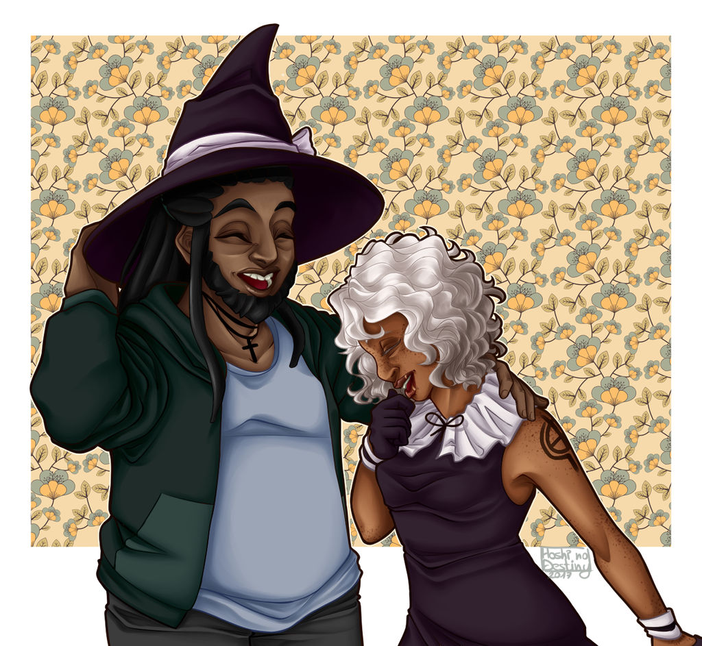
Art-trade with my friend  ! She asked me to draw her OCs Boris and Cornelia! I had so much fun drawing them, they're such cuties<3
I went with something cute/funny, I hope you like it!
 hoshinodestinyart.tumblr.com/p…
! She asked me to draw her OCs Boris and Cornelia! I had so much fun drawing them, they're such cuties<3 I went with something cute/funny, I hope you like it!
hoshinodestinyart.tumblr.com/p…Image size
1260x1160px 1.37 MB
Comments10
Join the community to add your comment. Already a deviant? Log In
From 
Great picture. Good form and designs. The linework itself is good, no problems on that part. You're able to get the expressions really well and the choice of colors also is quite good. I've commented on your work many times before, and there has been something I've always been pointing out. I've done it before, but I think I'll need to point it out again. There are too many folds around the sleeves of the characters. With this many folds, it looks as if the jacket is too big on the character, but that's clearly not the case, so I'd very much suggest reducing the folds on the sleeves.
Another thing I got to point out is some of the choice of lighting and shading. Perhaps it's just your style, but some of the shades and lighting, particularly on the face, gives a sort of mask look to it. Boris's face, in particular, looks a whole lot more like a hard mask, than a face of skin and flesh. If that's your style, then I guess it's really up to you. However, I just had to mention it.
Overall, this is still a good picture. I would again recommend reducing the folds on the sleeves and quite possibly alter the shading a little to make the faces look more organic. Keep it up!